
RETRO RADIANCE
Journal | No. 8
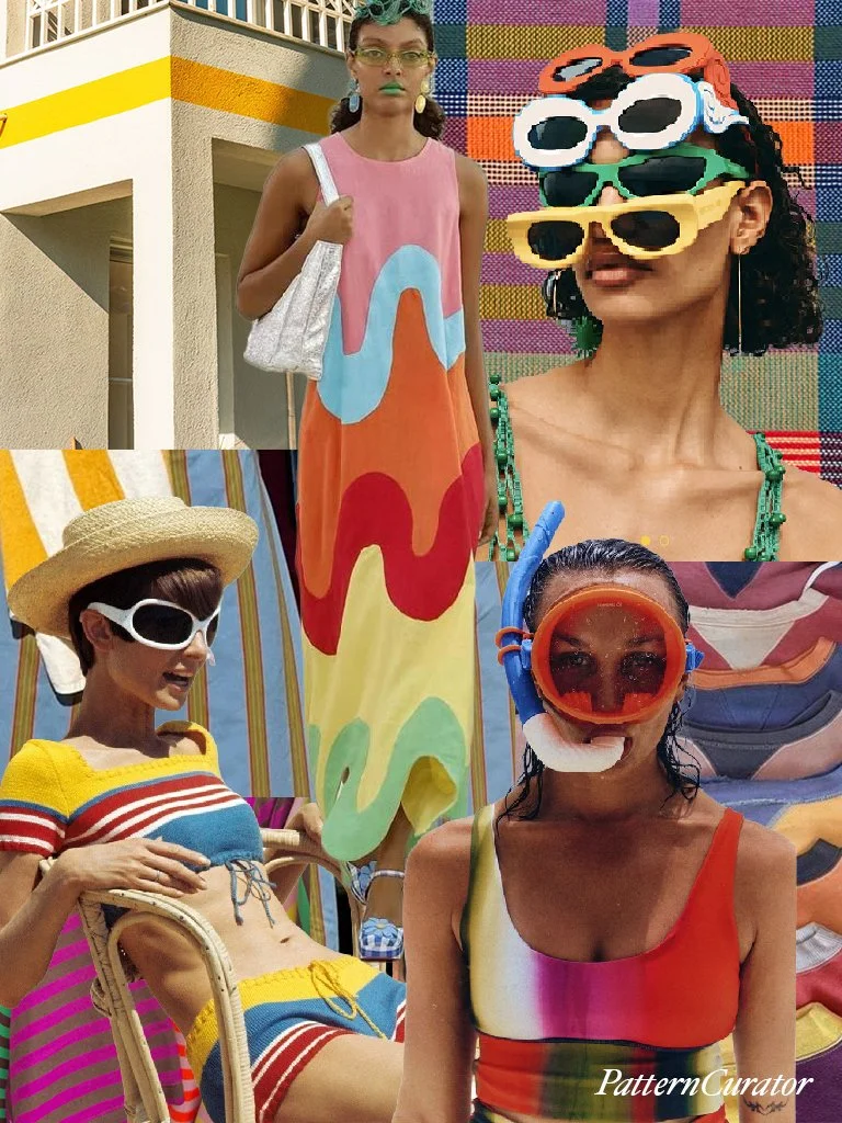
retro radiance
somewhere between a postcard from 1978 & a particularly fabulous pool party.
summer, with the volume turned up. oversized sunglasses, graphic stripes, wavy color blocking & swimwear that doesn't take itself too seriously. a little retro resort. a little pop art. a little more is more.
there's a wonderfully exaggerated quality to it all. colors that shouldn't necessarily work together, but absolutely do. pink, orange, turquoise, yellow & red. familiar summer staples reimagined with unexpected proportions, oversized graphics & a healthy disregard for subtlety.
nostalgia without the need to recreate the past. the optimism of vintage holiday advertising, the eccentricity of souvenir-shop finds & the unapologetic pleasure of dressing for absolutely no reason other than the occasion.
because sometimes summer calls for a little spectacle.
fashion
Missoni Mare — Beachwear 2025 — Vibrant stripes, zigzags, waves & layered beachwear.
Casablanca — Beach Club 2026 — Vintage-inspired resortwear, graphic stripes, crochet & wave-patterned knits.
Badgley Mischka — Resort 2025 — Multicolored striped caftans, California resort glamour & saturated summer color.
art & culture
Gene Davis — Smithsonian American Art Museum — Rhythmic multicolored stripes & 1960s Color Field painting.
Daniel Buren — MoMA — Repeated stripes, commercial awning fabrics & architectural interventions.
Spilling Over: Painting Color in the 1960s — Whitney Museum — Saturated color, Op art, visual perception & geometric pattern.