
FW 26/27 TREND DIRECTION
CURATORIAL INTELLIGENCE | FALL / WINTER 26/27 | PATTERN CURATOR
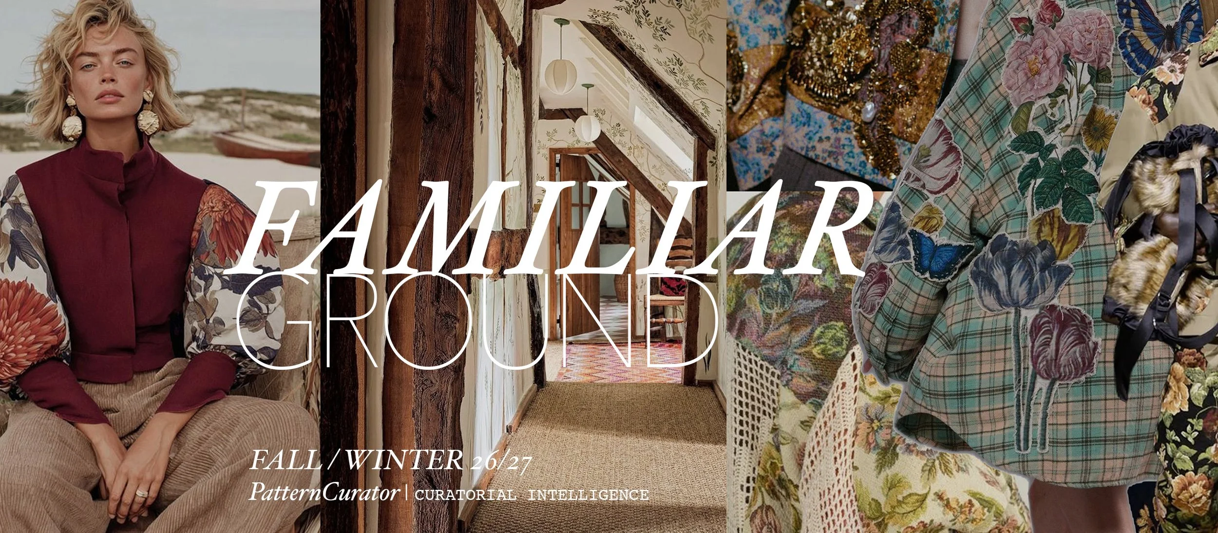
FW 26/27: FAMILIAR GROUND
Finding new relevance in what we already know.
Fall / Winter 2026/27 reflects a period of recalibration. After seasons of rapid change, excess and uncertainty, attention shifts toward what feels useful, enduring and emotionally familiar. Rather than abandoning novelty, design begins to ground it in references, materials and ideas that already carry meaning.
Across culture, design, color and pattern, the season reflects a desire to move forward without losing connection to what already works—to reconsider familiar ideas through a more intentional, contemporary lens.
Because the strongest recurring finding across the independent research is that FW26/27 is not about reinvention for its own sake. It is about reassessing value:
New ↔ Familiar
Progress ↔ Preservation
Utility ↔ Expression
Restraint ↔ Decoration
Modern ↔ Nostalgic
Polished ↔ Imperfect
Permanent ↔ Adaptable
Individual ↔ Collective
CULTURE — Rapid change creates a counter-interest in stability, familiarity and things with recognizable value. Consumption becomes more considered as longevity and usefulness carry greater weight.
TREND — Familiar forms and references are retained but adjusted through proportion, material, styling and unexpected combinations. Newness comes through reinterpretation rather than complete replacement.
CONCEPT — Nostalgia and heritage provide recognizable starting points, but the opportunity lies in shifting their context rather than simply recreating the past.
COLOR —Familiar, grounded colors establish stability while more expressive accents prevent the palette from becoming purely nostalgic or conservative.
PRINT + PATTERN —Traditional motifs, recognizable pattern languages and archival references are reconsidered through scale, layering, material and contemporary application.
The interesting thing is that recalibration isn't retreat. The research suggests a more selective approach to progress—keeping what still has relevance, questioning what doesn't, and allowing familiar ideas to become useful again.
01 CULTURE | 02 TRENDS | 03 CONCEPTS | 04 COLOR | O5 PRINT + PATTERN
01
CULTURE
What's shaping the season
FW26/27 is developing against a backdrop of economic uncertainty, more selective consumption and continued cultural and technological change. Consumers are becoming more deliberate about what they buy and keep, placing greater value on longevity, versatility, familiarity and things that feel worth investing in.

At the same time, nostalgia, heritage and recognizable references provide a sense of continuity. Rather than simply returning to the past, familiar ideas are being reconsidered for the present—updated through material, proportion, styling and context.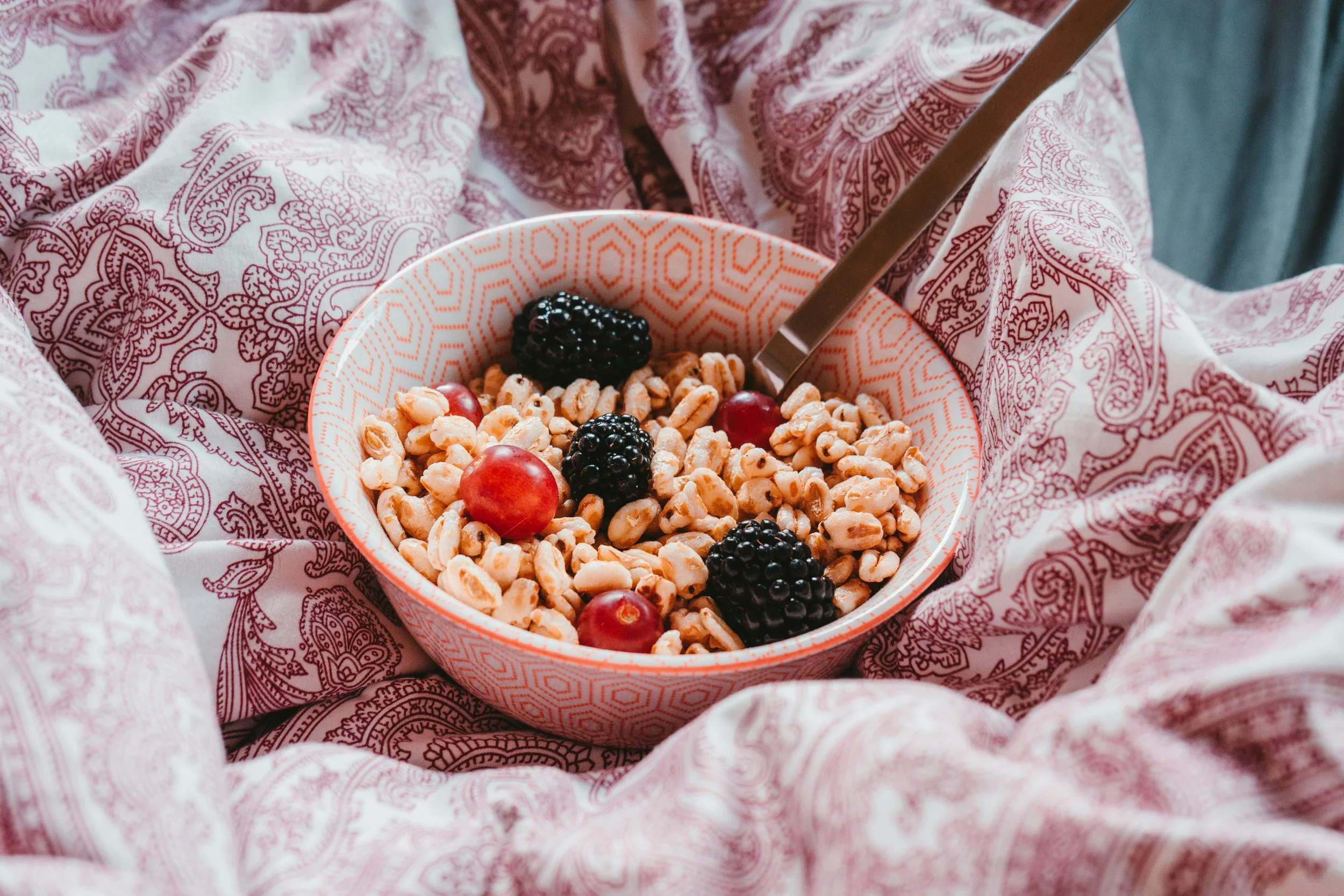
FAMILIAR COMFORT
Periods of uncertainty continue to strengthen the appeal of things that feel recognizable. Familiar foods, entertainment, aesthetics, rituals and cultural references offer continuity, but nostalgia is increasingly being edited rather than reproduced literally.The result is familiarity used as a foundation for something current—recognizable enough to create connection, but changed enough to feel relevant now.Culture Watch: nostalgia · heritage · familiar rituals · archive revival · cultural memory · reinterpretation
USEFUL BEAUTY
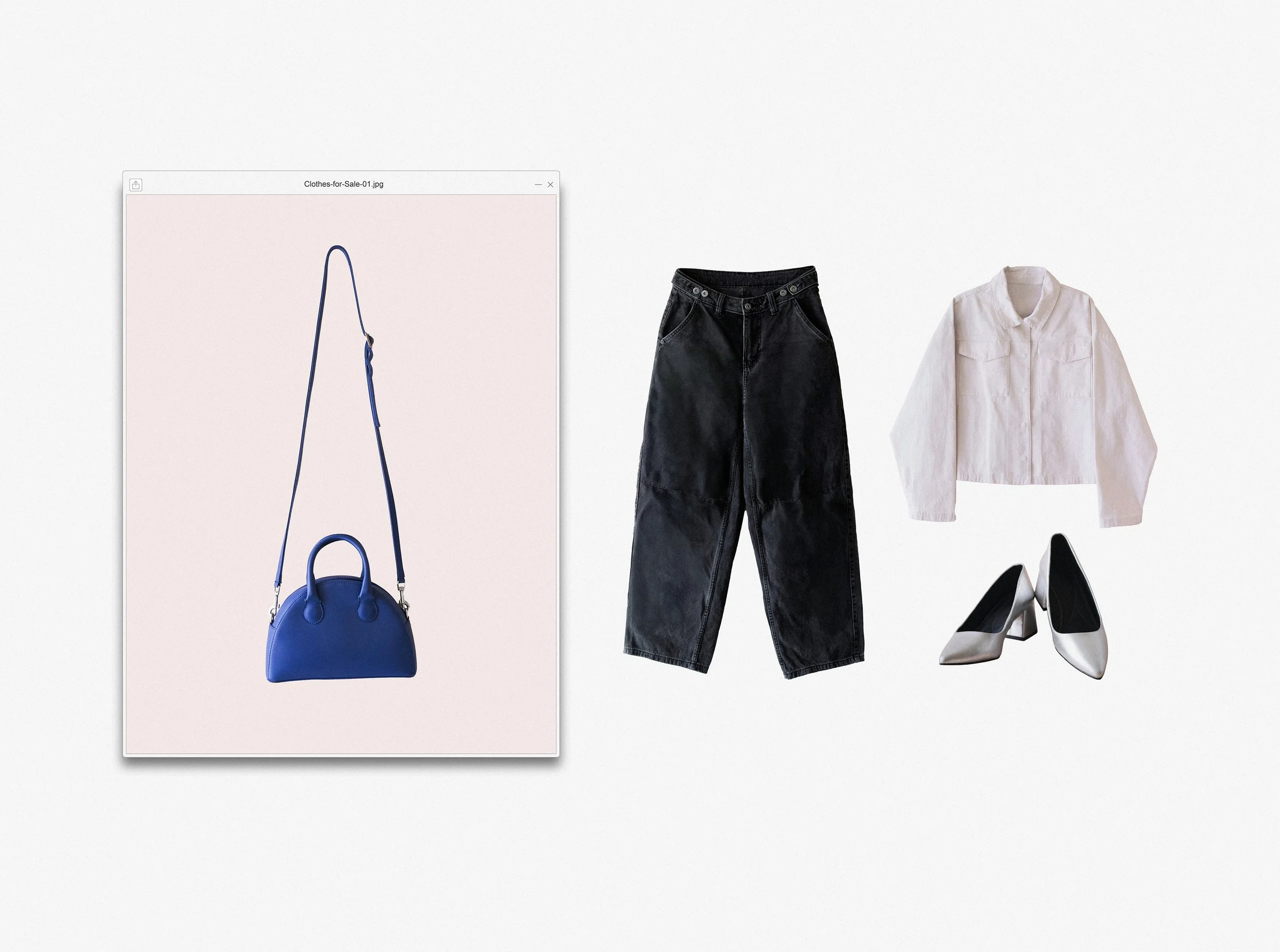
Utility is taking on greater cultural relevance as consumers look for objects, spaces and products that earn their place. Functionality does not eliminate decoration; instead, practical considerations increasingly become part of the aesthetic itself.The result is a growing appreciation for design that feels purposeful without becoming purely minimal or utilitarian.Culture Watch: functional design · adaptable products · utility details · practical luxury · multi-use · purposeful decoration
SELECTIVE VALUE
Economic pressure continues to reshape how people define value. Spending is becoming more deliberate, with greater consideration given to longevity, usefulness and whether something feels genuinely worth bringing into everyday life. This does not necessarily mean buying less across every category—it means becoming more selective about where money, time and attention go.The result is a more considered relationship with consumption, where value is increasingly measured by relevance and staying power rather than newness alone.Culture Watch: considered consumption · longevity · investment purchases · fewer, better · versatility · perceived value
RESTORATIVE LIVING
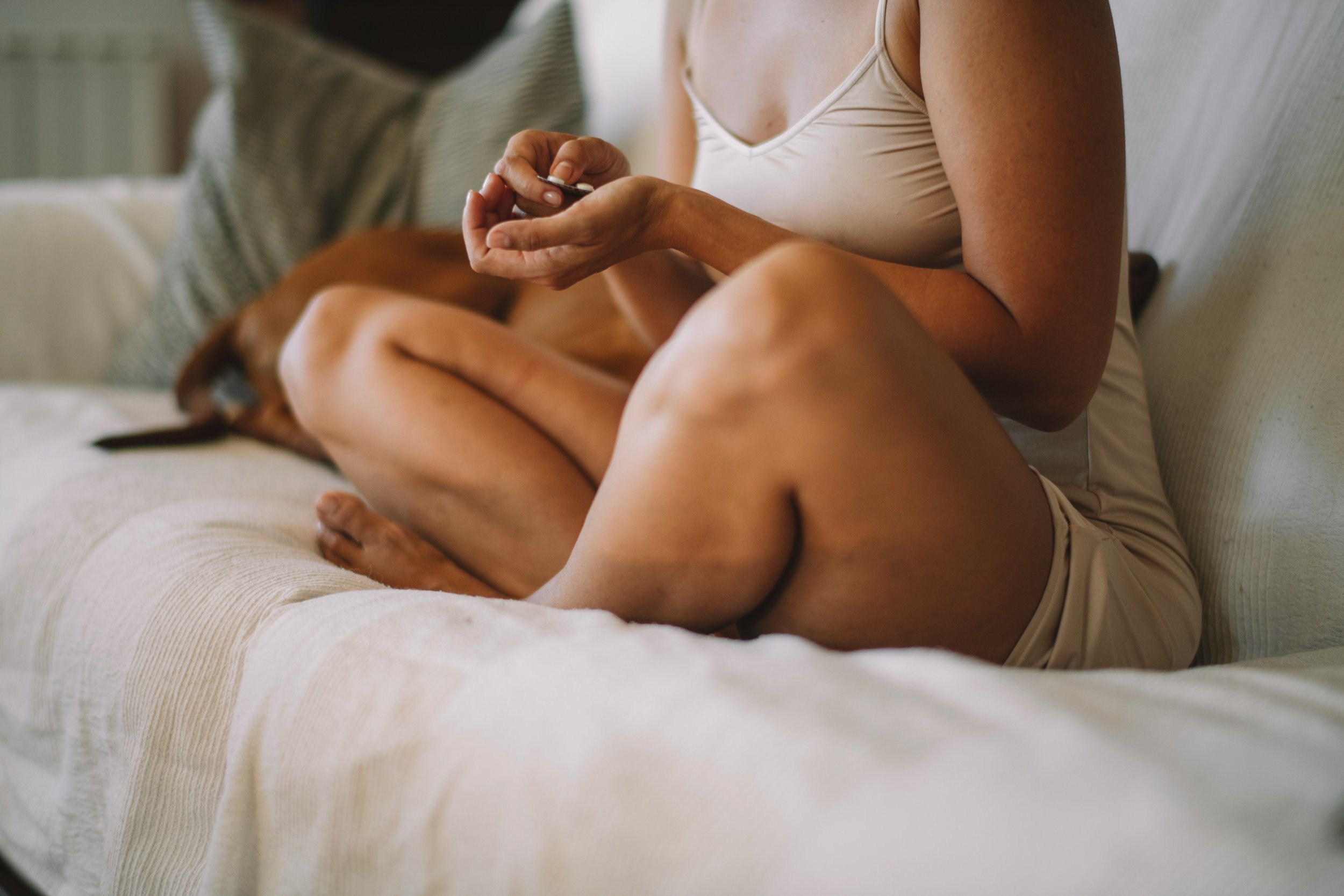
As everyday life remains fast, digitally saturated and demanding, restoration is becoming less about escape and more about how daily life is structured. Home, nature, hobbies, making, movement and slower routines provide ways to create periods of recovery within ordinary schedules.The result is a shift from wellness as an aspirational lifestyle toward smaller, repeatable practices that make everyday life feel more manageable and grounded.Culture Watch: restorative routines · home rituals · nature · making · analog hobbies · everyday wellbeing
LOCAL CONNECTION
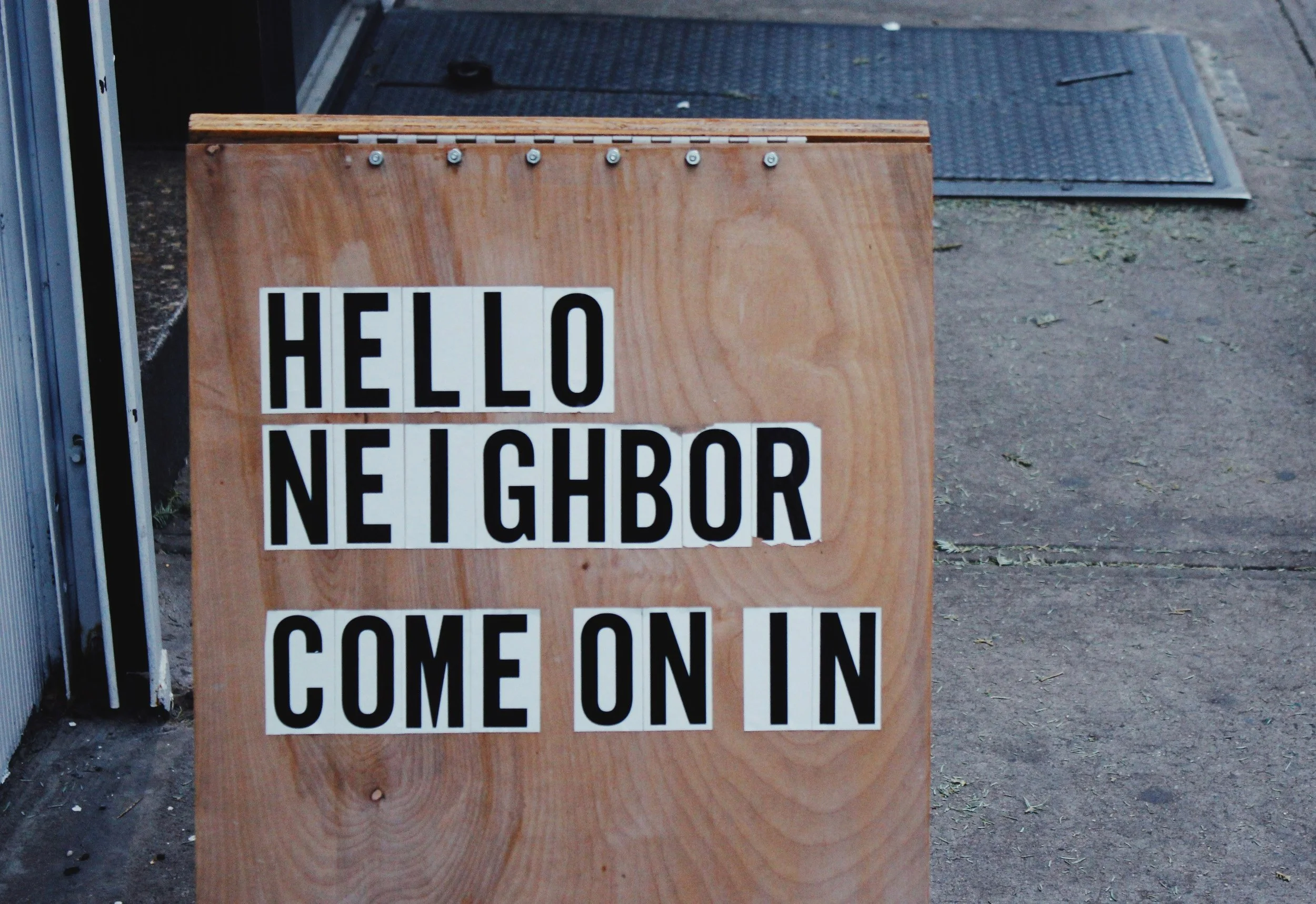
As culture becomes increasingly global and digitally accessible, proximity is gaining renewed relevance. Neighborhood businesses, regional traditions, local makers and community-based experiences offer a sense of specificity that large-scale digital culture cannot easily replicate.The result is greater interest in what feels connected to a particular place, community or point of origin rather than designed for universal appeal.Culture Watch: local makers · regional identity · neighborhood culture · provenance · community spaces · place-based experiences
PERSONAL CHARACTER
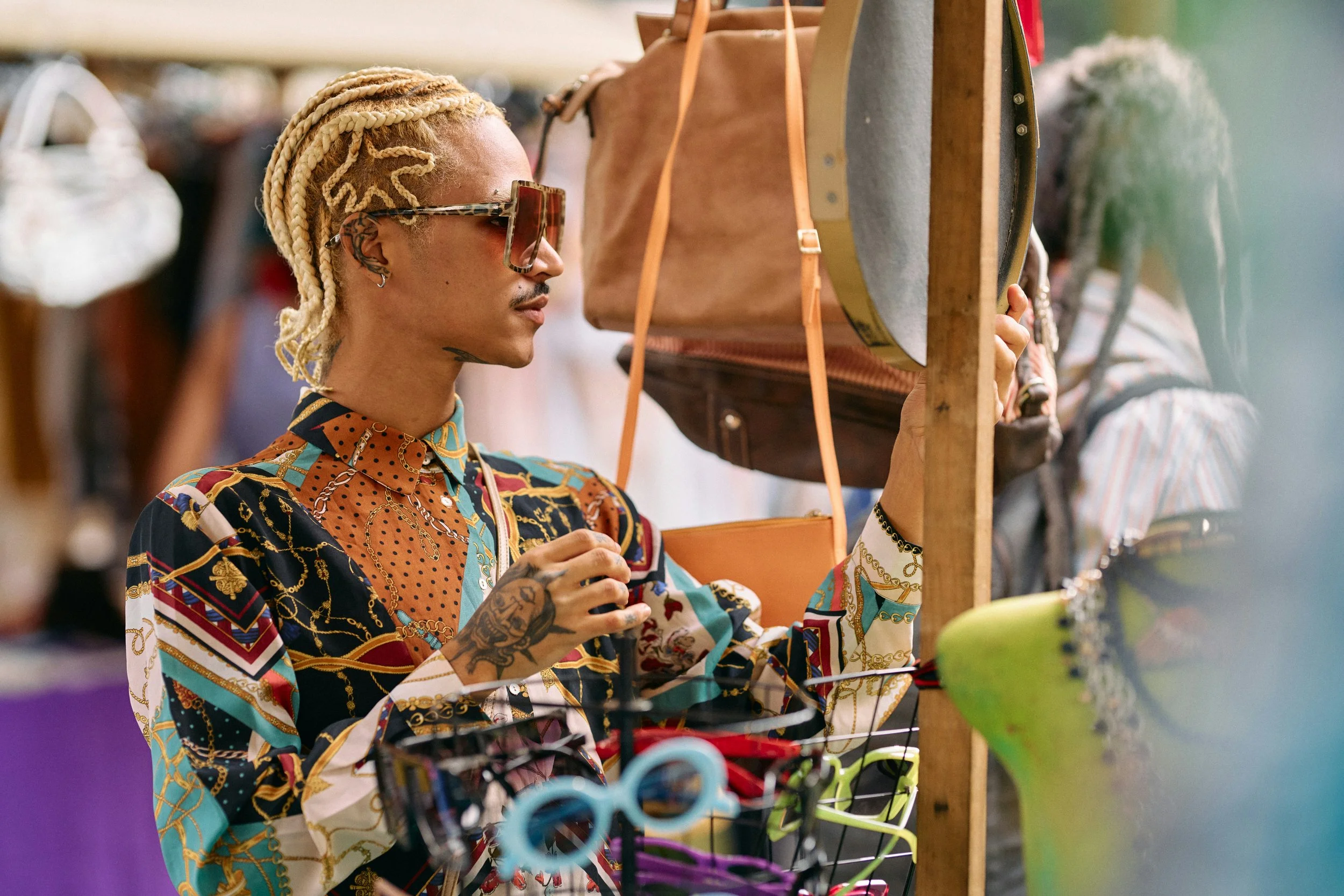
After years of highly recognizable aesthetics, algorithms and rapidly circulating visual trends, there is growing interest in choices that feel less prescribed. Personal collections, unexpected combinations, customization and visible signs of individual taste become more important than achieving a perfectly coordinated look.The result is a move away from aesthetic conformity toward environments, wardrobes and objects that feel accumulated, specific and personally authored.Culture Watch: personalization · collected interiors · eclectic styling · customization · individual taste · imperfect coordination
02
TRENDS
What's changing in design
Across the research, design is becoming more grounded, expressive and selective. Familiar references are returning with greater weight, but rather than being reproduced literally, they are being refined through material, proportion, construction and styling. Utility and longevity are increasingly important, while decoration, character and emotional familiarity prevent practicality from becoming purely minimal.

The result is design that feels considered rather than restrained—drawing from what is already known, useful and enduring, then adjusting it for how people want to live now.
REWORKED CLASSICS
Familiar forms become the starting point rather than the finished idea.
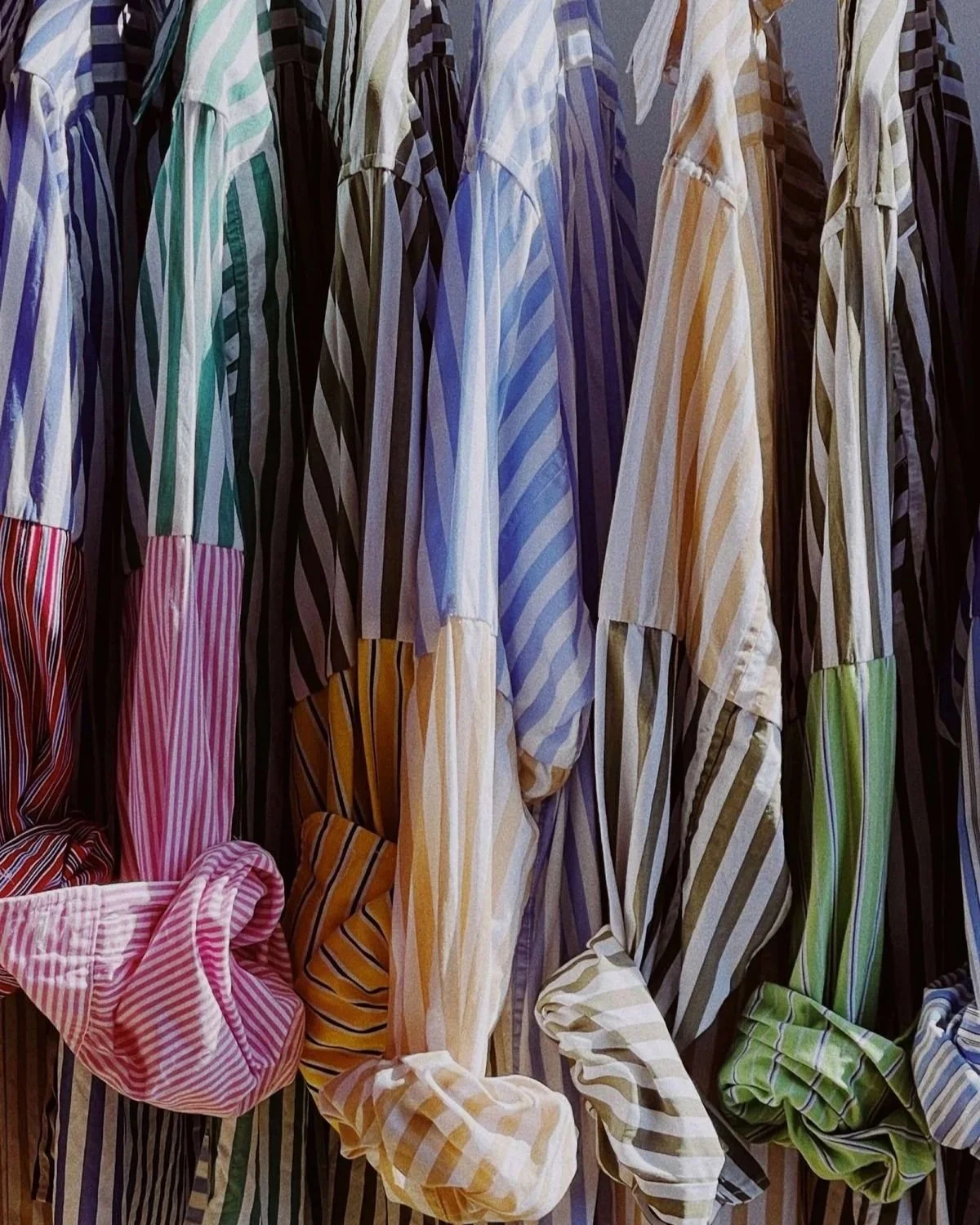
Heritage, traditional design codes and recognizable archetypes remain important, but they are increasingly shifted through proportion, material, color and context. Tailoring becomes less formal, traditional motifs appear at unexpected scales and established references are combined with contemporary elements. Recognition creates the initial connection; alteration makes it feel current.The result is a design language that uses familiarity without becoming purely nostalgic.Print Watch: heritage motifs · altered checks · updated stripes · archival florals · shifted scale · traditional motifs in unexpected color
Trajectory: Strong
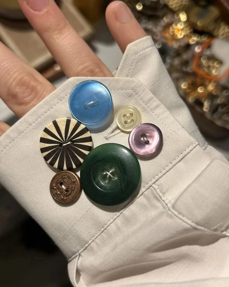
ELEVATED UTILITY
Function becomes part of the aesthetic.
Practical details continue to move beyond purely functional categories and into broader design. Pockets, hardware, modular elements, durable materials and workwear references are refined rather than hidden, allowing utility itself to provide visual interest. The emphasis is less on overt technical performance and more on objects and garments that appear capable, adaptable and useful.The result is practicality with greater character—design that looks considered because of how it works.Print Watch: grids · engineered placement · workwear markings · functional stripes · maps and diagrams · structured geometrics
Trajectory: Accelerating
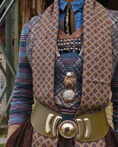
COLLECTED LAYER
Design becomes more personal through accumulation.
Rather than relying on a single coordinated aesthetic, interiors, fashion and visual design increasingly combine references from different periods, places and styles. Pattern sits against pattern, old against new and polished against worn. The effect feels assembled over time rather than created all at once.The result is a richer, less prescribed visual language where individuality comes through what is combined rather than adherence to a singular look.Print Watch: mixed florals · pattern-on-pattern · mismatched coordinates · patchwork · archival combinations · decorative layering
Trajectory: Growing
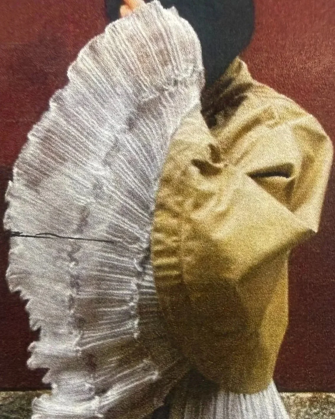
SOFTENED STRUCTURE
Order remains, but its edges become less rigid.
Structured forms, tailored references and disciplined design systems are being balanced by softer materials, relaxed proportions and tactile surfaces. Precision is still visible, but it is interrupted by drape, texture, irregularity and more comfortable construction. The contrast allows design to feel polished without appearing overly controlled.The result is a quieter evolution of structure—maintaining clarity and intention while allowing greater ease and humanity.Print Watch: softened geometrics · blurred checks · irregular grids · hand-drawn lines · tonal pattern · disrupted symmetry
Trajectory: Emerging
03
CONCEPTS
What it could look + feel like
Concept Intelligence identifies emerging visual worlds created by combinations of culture, lifestyle, objects, places, aesthetics and design.

The concepts emerge from several signals repeating across the research: a renewed interest in familiarity and longevity; utility becoming more expressive; nostalgia shifting from literal revival toward reinterpretation; and growing interest in environments and objects that feel collected rather than perfectly coordinated. Across these directions, comfort does not necessarily mean simplicity and practicality does not mean minimalism. Familiar design languages are being layered, softened and personalized.

Together, the concepts suggest a season built around reconsidering what already has value—then giving it new relevance through context, combination and character.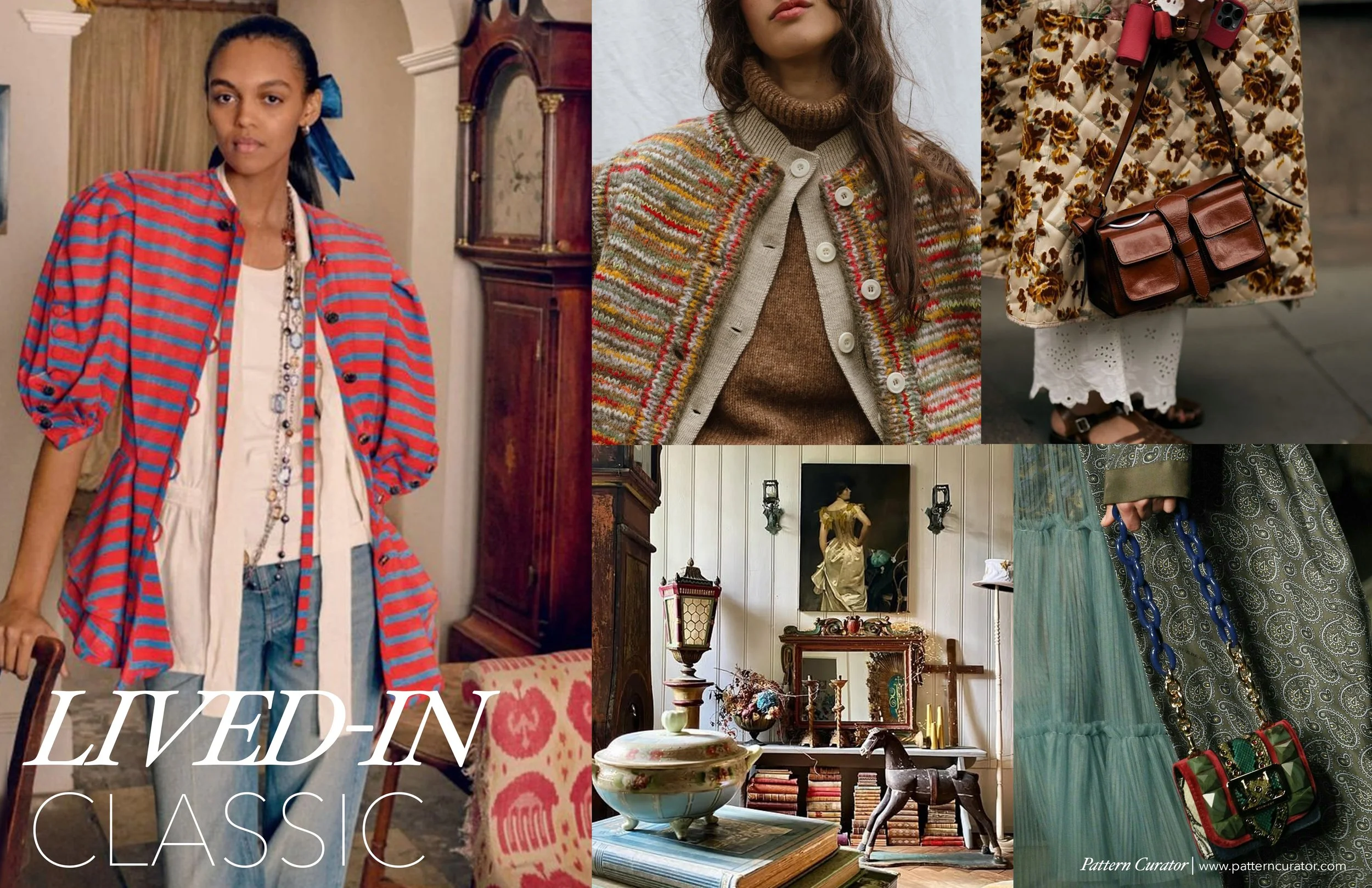
LIVED-IN CLASSIC
Familiarity with character.
Traditional interiors, tailored clothing, heritage textiles and everyday objects create a world that feels established without becoming formal. Checks, stripes, florals, leather, wood, wool and familiar furniture shapes are mixed with signs of use and personality. Nothing feels overly coordinated or newly installed. The appeal comes from things that look as though they belong.This isn't a return to traditionalism. It is classic design made more relaxed, personal and imperfect.Look for: checks · ticking stripes · small florals · wool · leather · dark wood · books · ceramics · tailored shapes · worn surfaces · framed art · traditional textiles
Feeling: familiar · grounded · comfortable · established · personal
PRACTICAL ROMANCE
Utility meets decoration.
Workwear, functional objects and practical materials are softened through color, pattern and decorative detail. Canvas sits beside florals, utility pockets meet embroidery, sturdy furniture is paired with patterned textiles and everyday objects become visually considered. Function remains important, but usefulness no longer requires visual restraint.The tension comes from treating practical design with unexpected tenderness.Look for: utility pockets · canvas · ticking · workwear · aprons · embroidery · small florals · painted furniture · hardware · baskets · stripes · functional ceramics
Feeling: useful · charming · tactile · unpretentious · expressive
THE COLLECTOR
More accumulated than coordinated.
Objects, references and patterns from different periods are brought together through personal taste rather than a singular aesthetic rule. Vintage furniture, contemporary objects, artwork, souvenirs, textiles, books and decorative pieces create environments that feel assembled gradually. Pattern mixing and unexpected combinations add individuality.The value is in specificity. What matters is not whether everything matches, but whether the combination feels personally chosen.Look for: mixed pattern · vintage objects · artwork · books · souvenirs · decorative boxes · mismatched ceramics · layered textiles · framed ephemera · unusual objects · old + new
Feeling: eclectic · curious · layered · intelligent · individual
On our radar
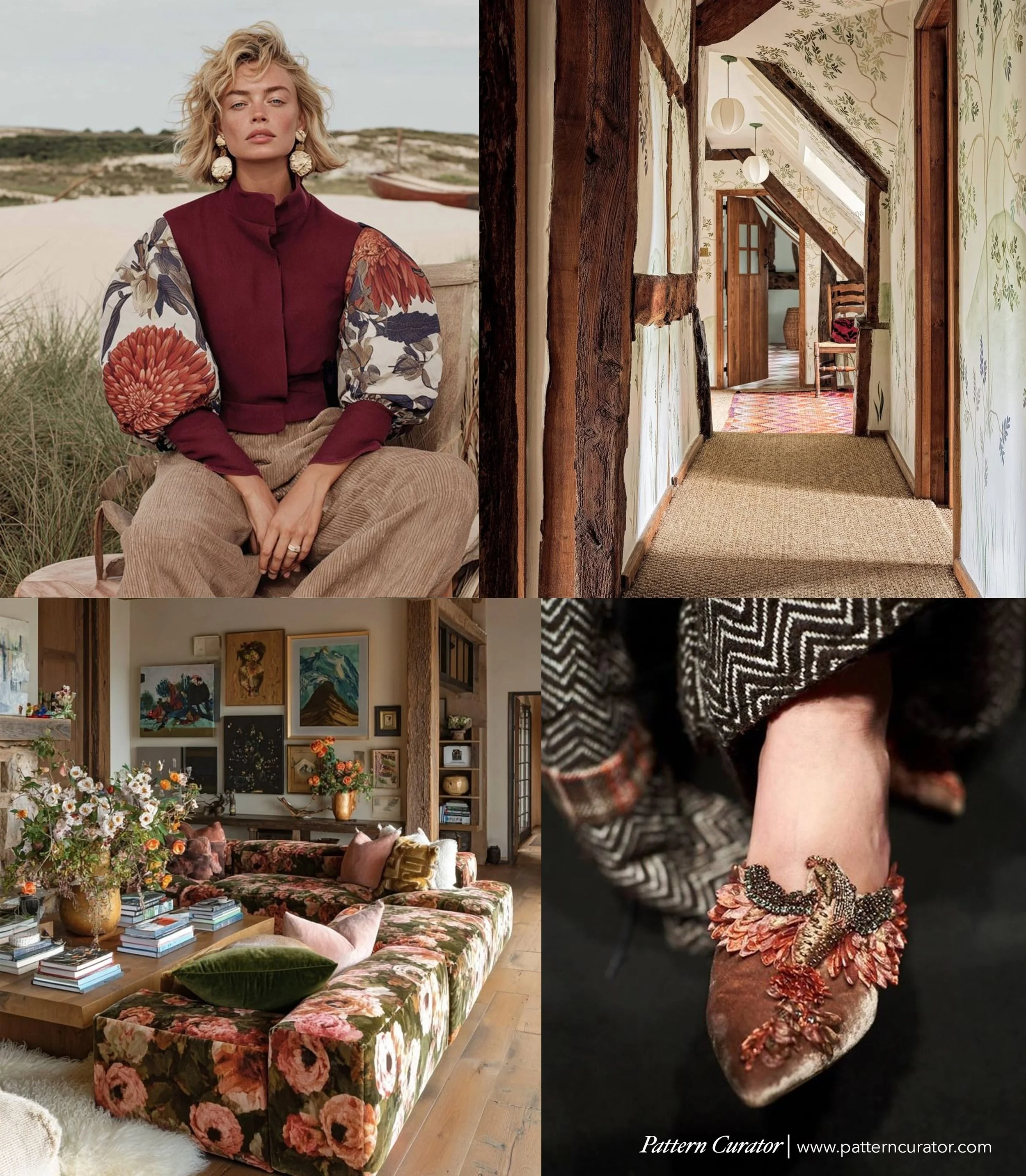
COUNTRY MODERN
Rural references without the nostalgia.Agricultural landscapes, barns, practical furniture, natural materials and country textiles are being stripped of overt rustic styling and combined with cleaner contemporary design. Gingham, checks, wood, metal and utilitarian objects remain, but the overall environment feels sharper and less sentimental.Look for: gingham · checks · raw wood · galvanized metal · farm imagery · simple furniture · utility textiles · baskets · field colors
Feeling: rural · clean · functional · grounded · contemporary
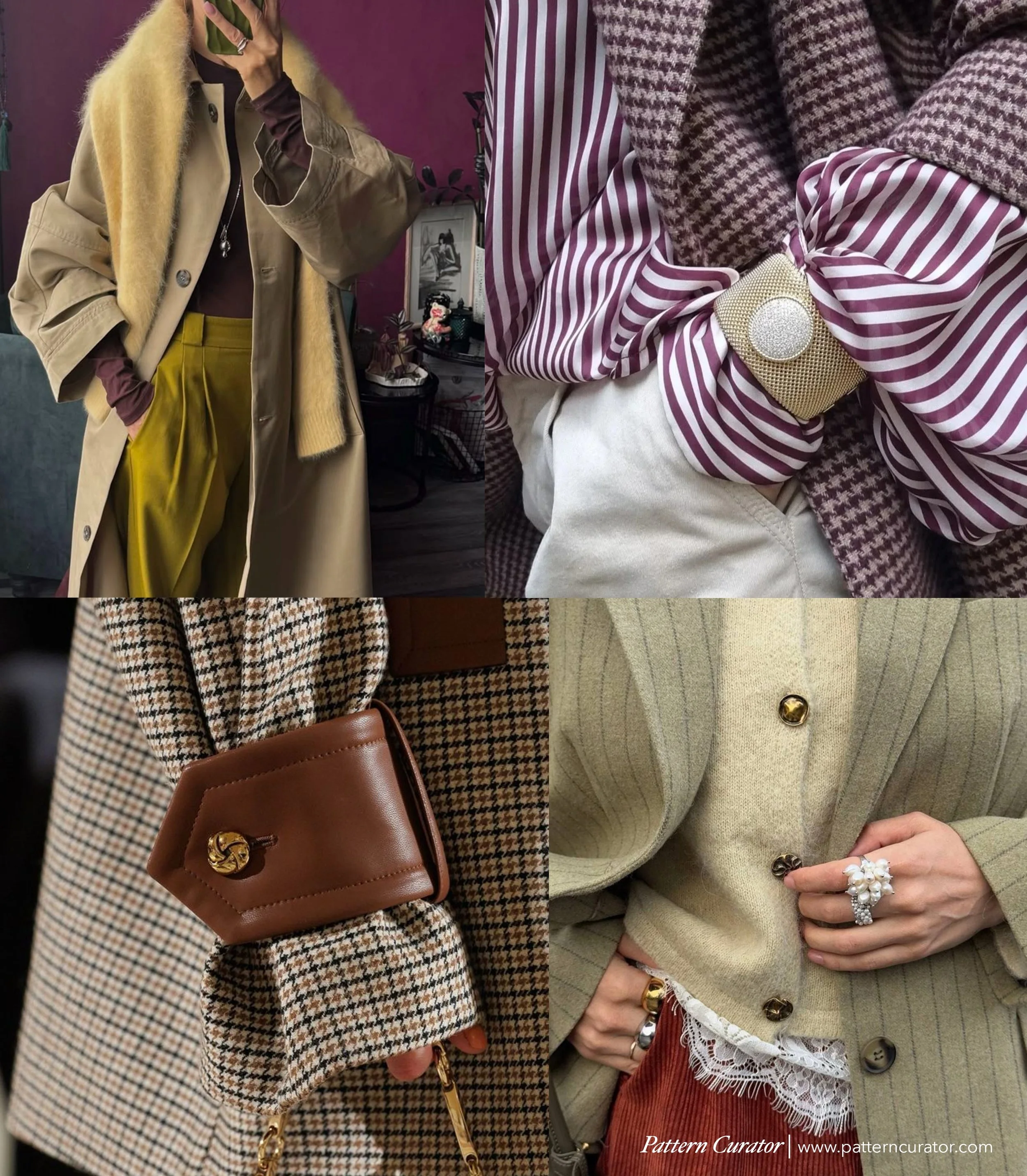
GENTLE FORMALITY
Polish loosens up.Tailoring, traditional rooms, decorative objects and more formal design codes remain visible, but their presentation becomes softer and less precious. Structured pieces coexist with relaxed textiles, imperfect arrangements and casual styling. Formality becomes something to borrow from rather than a complete lifestyle.Look for: tailoring · pleats · polished wood · damask · decorative trim · table linens · traditional furniture · softened geometrics · drapery · silver
Feeling: refined · relaxed · composed · softened · quietly decorative
04
COLOR CONCEPTS
What’s changing chromatically
FW26/27 color is less about novelty and more about familiar shades gaining new relevance through depth, proportion and combination.

The strongest emerging behavior pairs grounded, enduring colors with clearer, more expressive accents—creating palettes that feel familiar without becoming predictable.
NATURAL + CHARGED
FW26/27 color balances a grounded, familiar foundation with sharper, more expressive interruption. Coffee, tobacco, olive, loden, rust, taupe, stone and charcoal establish an earthy, enduring base, while Deep Teal, Icy Blue, Mauve, Chartreuse, Poppy Red, Merlot, Cobalt and Cool Pink bring greater clarity, contrast and energy.Emerging Color
Movement is happening through greater depth and specificity. Chartreuse shifts away from neon toward deeper yellow-green, while blue becomes colder and clearer through Icy Blue. Mauve brings a cooler evolution of purple, Poppy Red sharpens the continued importance of red, and Deep Teal moves between natural and more saturated color. Rust continues to evolve as an increasingly important earth-derived shade.Color Connections
The season becomes more directional through unexpected combinations. Coffee is cooled by Icy Blue, Olive meets Mauve, and Rust is energized by Chartreuse. Merlot with Cool Pink creates a tonal but less expected relationship, while Taupe with Cobalt and Charcoal with Poppy Red use familiar neutrals to ground stronger color.Continuing Color
Several established colors continue into FW26/27 rather than disappearing. Navy, olive, camel, burgundy, chocolate brown, bright red and royal purple remain relevant, with their evolution coming through updated proportions, combinations and applications.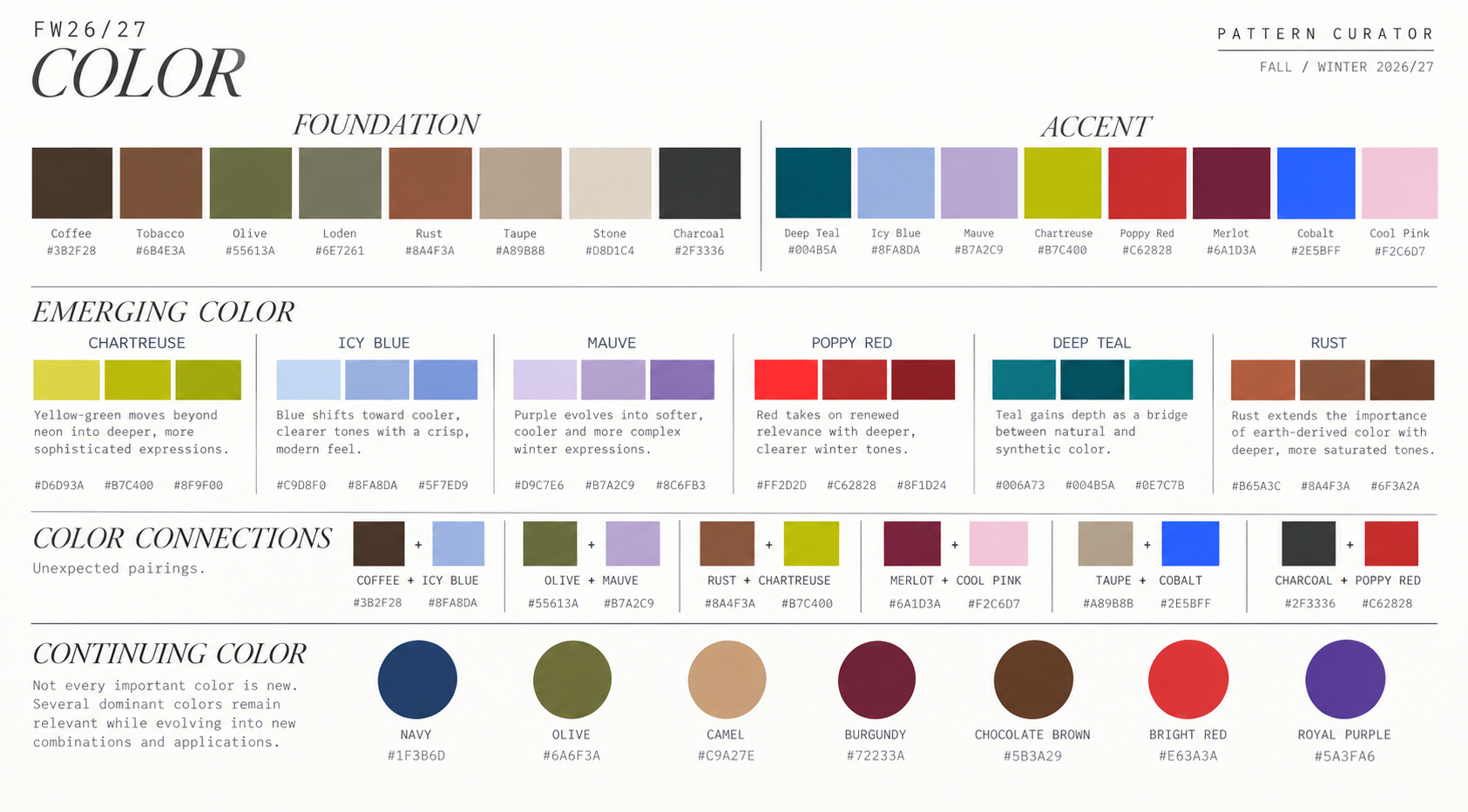
05
PRINT + PATTERN
What’s changing on the surface
For FW26/27, print evolves through reinterpretation rather than reinvention. Familiar pattern languages are being shifted through scale, layering, texture and unexpected combinations, while heritage references, utility and decorative detail create surfaces that feel both recognizable and newly considered.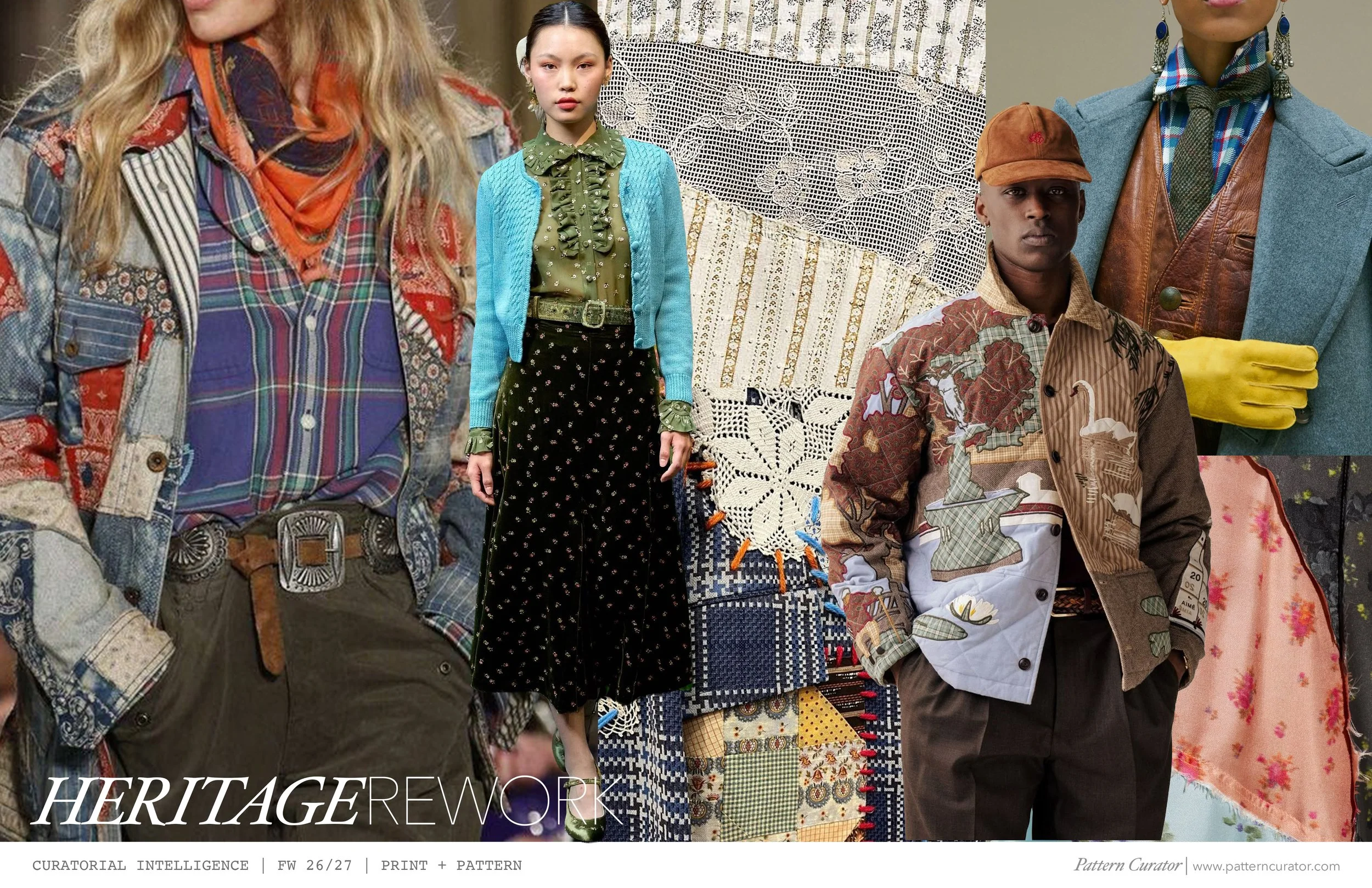
HERITAGE REWORK
Tradition gets rearranged
Checks, tartans, paisleys and familiar heritage motifs are shifted through scale, cropping, layering and unexpected color, keeping their recognizable foundations while loosening the rules around how they are used. Traditional pattern feel current without losing its history.Watch: oversized checks · broken tartan · recolored paisley · mixed heritage · altered scale · archival motifs
Women / Fall 2026 runway — Burberry: house checks and tartans are reworked through scale, fabrication and styling; the collection also introduces map imagery into the house’s established British codes.
Vogue Runway — Burberry Fall 2026Women / Fall 2026 runway — Toga: traditional plaid and tweed suiting is pulled, wrapped, layered and disrupted by unexpected materials and construction.
Vogue Runway — Toga Fall 2026Runway trend — London Fall 2026: ELLE specifically identifies plaid as a renewed direction, citing unexpected color, exaggerated scale and mixing with florals and embroidery at Toga, Burberry, Erdem and Maximilian Raynor.
ELLE — London Fashion Week Fall 2026 Trends
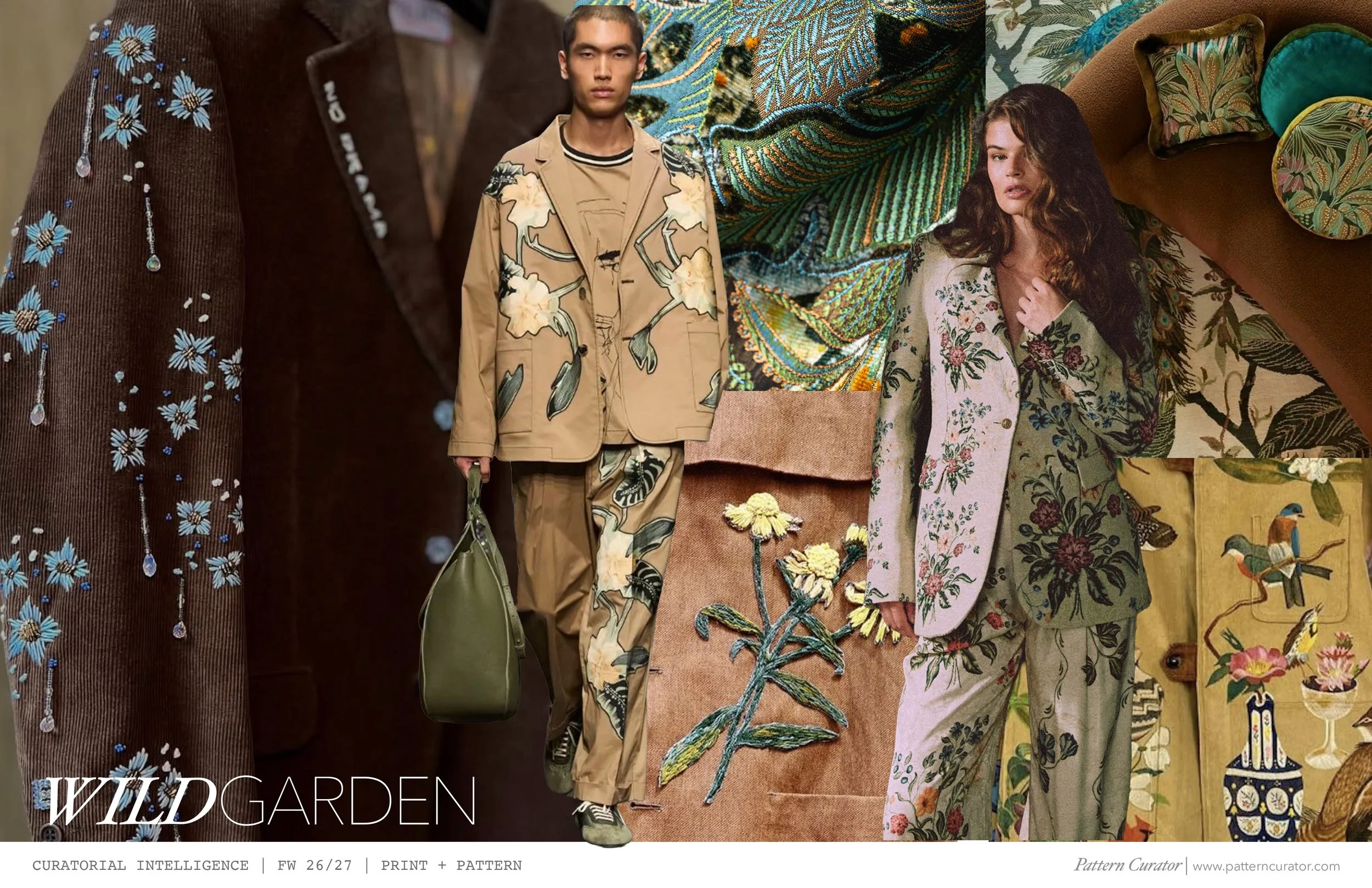
WILD GARDEN
Florals grow less controlled
Florals move away from neat coordination toward denser, more irregular arrangements. Small blooms, botanical studies, trailing vines and larger flowers mix across scales, creating gardens that feel overgrown rather than composed. Romantic, abundant and intentionally untamed.Watch: tangled florals · trailing vines · mixed scale · botanical studies · scattered blooms · dense ground
Women / Fall 2026 runway — Phoebe English: the collection functions as a wearable botanical almanac, moving through flowers and plants including snowdrop, dandelion, foxglove, fern, rose hip and ivy berry.
Vogue Runway — Phoebe English Fall 2026Women / Fall 2026 runway — Erdem: florals become part of a much denser decorative language, appearing through collaged brocades, quilting, embroidery and botanical embellishment rather than straightforward floral print alone.
Vogue Runway — Erdem Fall 2026Broader runway signal — Fall 2026: Vogue identifies nature as an ongoing runway source, noting the continuation of flora and organic references through the Fall 2026 collections.
Vogue — Flora-Filled Runway Looks
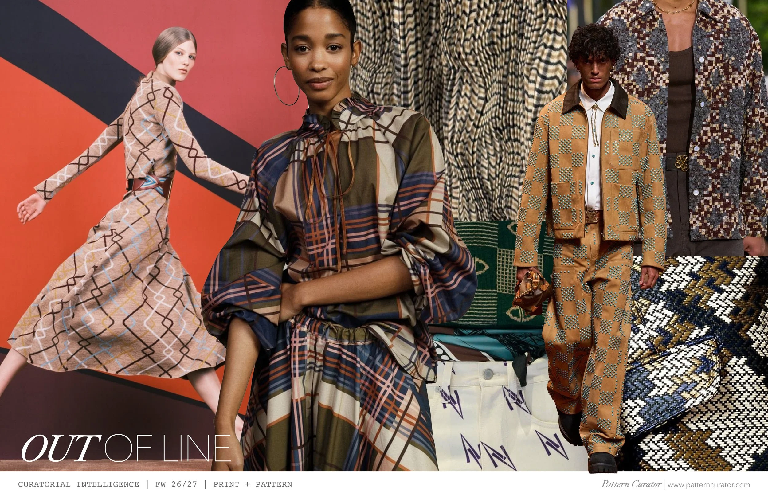
OUT OF LINE
Geometry loosens up
Stripes, grids, checks and geometric structures become less precise through wavering lines, uneven spacing, softened edges and hand-drawn construction. Movement and individuality to traditionally ordered pattern.Watch: irregular stripe · softened grid · hand-drawn check · wavering line · imperfect geometry · disrupted symmetry
Women / Fall 2026 runway — Toga: plaid, tailoring and ordered constructions are physically manipulated through pulling, crumpling, wrapping, slashing and layering—useful evidence for pattern structures becoming deliberately less controlled.
Vogue Runway — Toga Fall 2026Women / Fall 2026 runway — Burberry: the familiar grid of the Burberry check remains visible, but appears through altered scales, shiny surfaces, layering and more graphic applications.
Vogue Runway — Burberry Fall 2026Runway research — Fall 2026: Patternbank’s Fall 2026 catwalk analysis identifies print and pattern as a significant runway story across collections including Dries Van Noten, Erdem, Etro, Zimmermann, Anna Sui, Antonio Marras, Rabanne and Libertine.
Patternbank — Fall 2026 Catwalk Print + Pattern Highlights
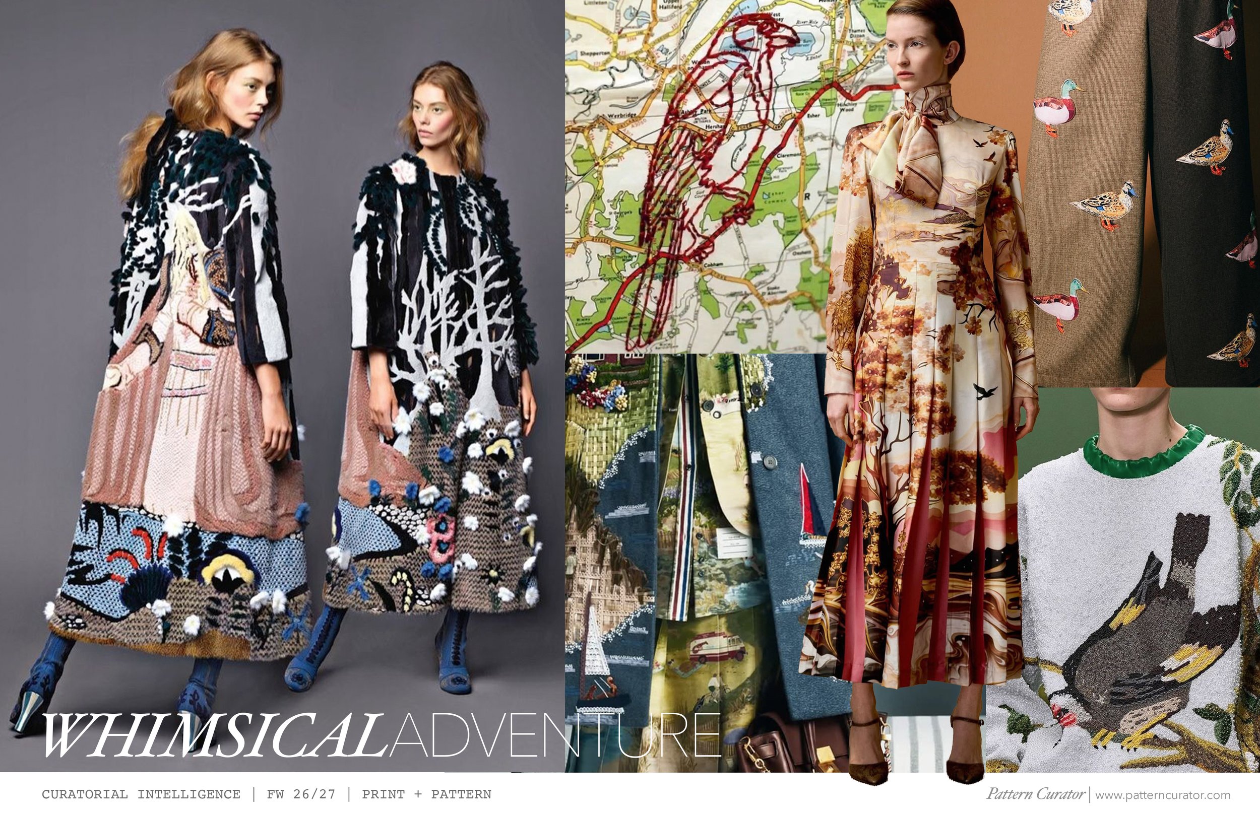
WHIMSICAL ADVENTURE
Pattern tells a story
Illustrative landscapes, animals, botanicals, maps and unexpected objects create prints that feel discovered rather than purely decorative. Familiar motifs are combined into imaginative scenes that move between nature, travel, folklore and fantasy. The result brings narrative and curiosity back to the surface.Watch: maps · diagrams · handwritten marks · labels · botanical notes · symbols · technical drawings
Women / Fall 2026 runway — Burberry: Daniel Lee uses cartography literally, including a map trench and map-embroidered parka and pants—turning information associated with place and navigation into surface design.
Vogue Runway — Burberry Fall 2026Women / Fall 2026 runway — Hope for Flowers: hand-drawn curio imagery, foulard prints, monograms and bandana graphics bring together illustration, collected motifs and graphic markings.
Vogue Runway — Hope for Flowers Fall 2026Women / Pre-Fall 2026 — Erdem: tattoo history becomes source material for tendril-like flowers, carnations, daisies and symbolic motifs, translating personal and historical documentation into pattern.
Vogue Runway — Erdem Pre-Fall 2026
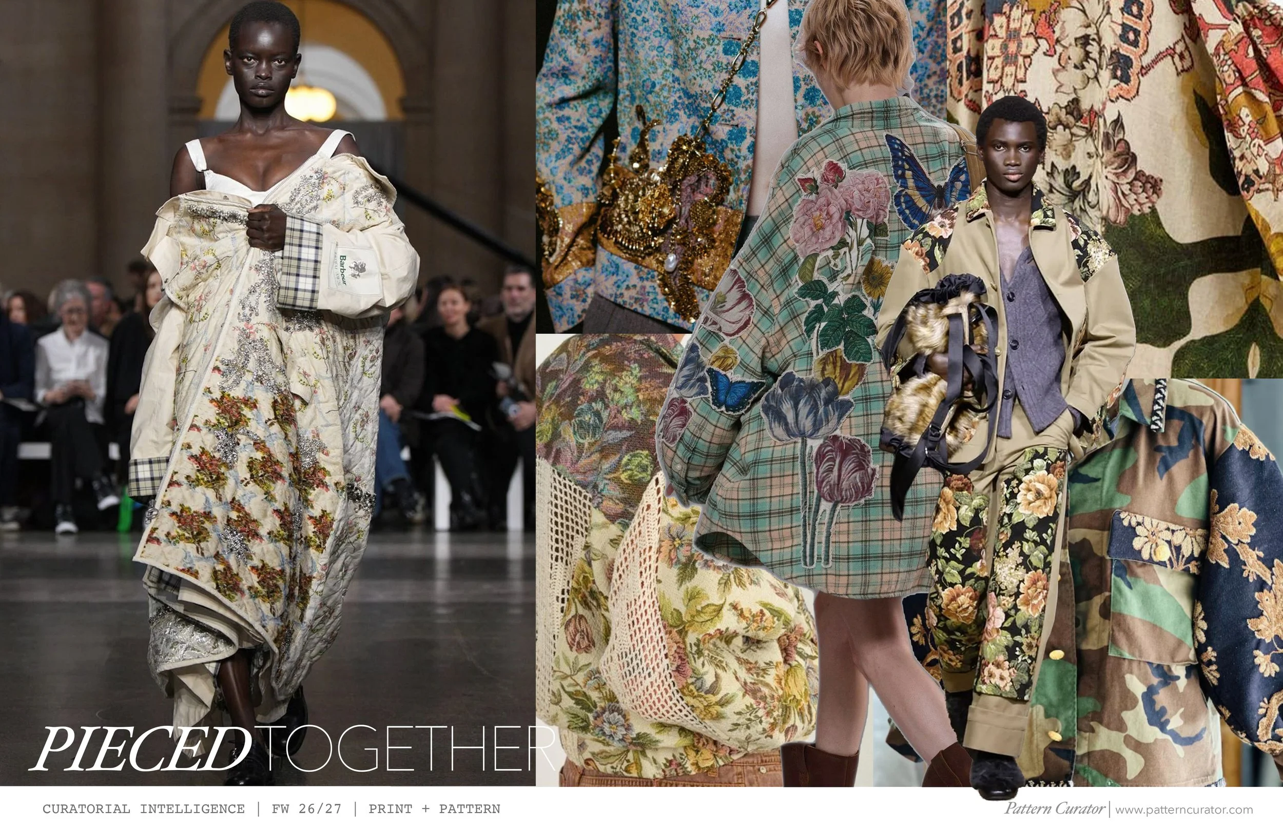
PIECED TOGETHER
Pattern is constructed through combination
Contrasting motifs, materials and scales are patched, spliced and layered together rather than resolved into a single seamless repeat. Florals meet checks, borders interrupt grounds and fragments appear visibly assembled. The combination itself as part of the design.Watch: patchwork · spliced motifs · mixed scale · pattern-on-pattern · border mixing · textile collage · visible joins
Women / Fall 2026 runway — Erdem: one of the clearest references for this direction. The collection uses collaged brocades and satins, upcycled textile and embroidery swatches, floral quilting and what Erdem describes as a “mash-up”; Vogue characterizes the effect as chopped-up vintage bricolage.
Vogue Runway — Erdem Fall 2026Fall 2026 runway — Off-White: Ib Kamara describes a process of cutting and pasting to create rhythm, while the collection combines patchwork denim, cutouts, nylon against lace, graphics and contrasting materials.
Vogue Runway — Off-White Fall 2026Tokyo / Fall 2026 — Yushokobayashi: folky patchwork dresses, bed-quilt coats, hand-painted florals and a patchwork checked dress make the assembled quality of pattern especially literal.
Vogue Runway — Yushokobayashi Tokyo Fall 2026
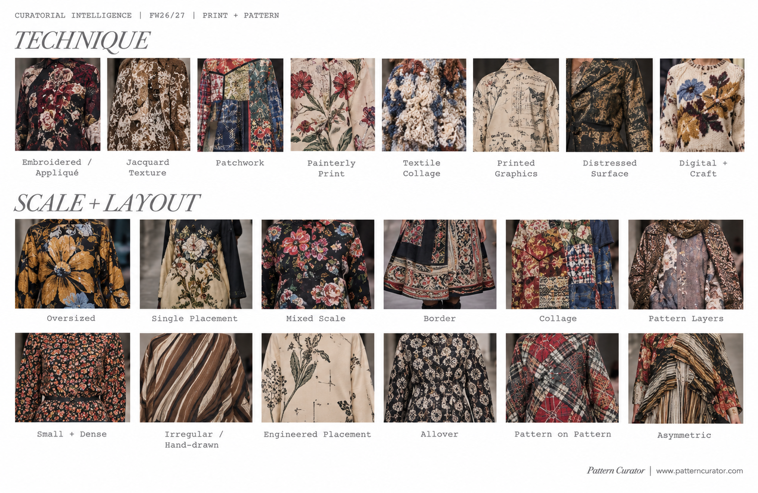
TECHNIQUE, SCALE + LAYOUT
Familiar pattern becomes less predictable.
For FW26/27, familiar print languages are being reworked through technique, scale and composition. Embroidery, appliqué, jacquard, patchwork, painterly marks and distressed surfaces give heritage and botanical motifs greater character, while oversized florals, irregular layouts, borders, placements and pattern-on-pattern combinations loosen the structure of the repeat. The larger movement is from coordinated pattern toward something more collected, altered and individually composed.THE FW 26/27 OVERVIEW
Fall / Winter 2026/27 doesn't rely on reinvention.Instead, the research reveals a season of reconsideration.Familiar ideas return with new relevance.Heritage is reworked rather than simply revived.Utility becomes more expressive and decoration more purposeful.Grounded color is energized through unexpected combinations.Pattern becomes collected, altered and less perfectly coordinated.The emerging opportunity is not replacing what came before.It is finding new ways to make the familiar feel relevant again.
ABOUT CURATORIAL INTELLIGENCE/ DISCLAIMER
Curatorial Intelligence is Pattern Curator's AI-led research platform, identifying emerging cultural, design, color and print + pattern signals through independent research and cross-analysis.
Each seasonal edition examines five distinct lenses—Cultural Behaviors, Trends, Concepts, Color and Print + Pattern—before analyzing where the findings converge.
The research is intentionally separated from Pattern Curator's human-curated seasonal direction, creating an independent view of what may be emerging next.
Please refer to this report as an educational and editorial report on what’s happening currently to inform future development. All information is AI-assisted. All information is for reference only. We do not guarantee any results from our reports.